RESEARCH I: Elements of Colors and Lighting Techniques
Visual Merchandising is commonly accepted as a merchandising techniques that uses visual elements effectively. Visual elements are refers to lighting, colors and signage. In short, they are the visual communications in designing the whole environment of the store along to give emphasis and give more impact to the merchandise.
COLOR
 Color is accepted as the biggest motivation for shopping. Pegler (2006: 7) suggests that people buy color before they buy, size, fit, or price. Colors says something about the kind of merchandise and merchandiser.
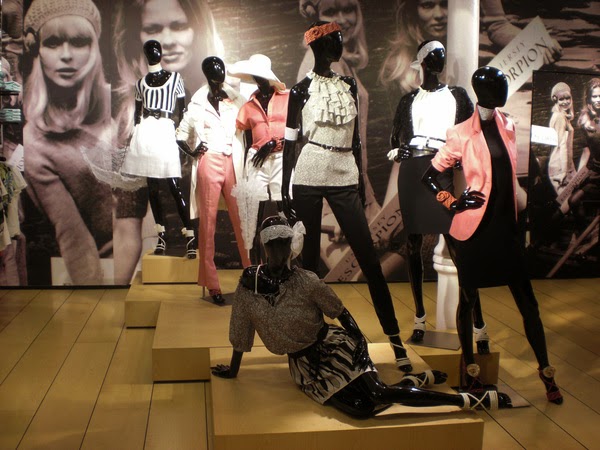
 According to him, "colors psychology is very important in visual merchandising. Colors can immediately creat a mood. Most of us have colors that tend to cheer us up when we are feeling down and colors colors tht calm us. Each of us also has colors that can make us physically feel hotter or cooler. An an instance, orange, green and purple are the colors used in the window display of a brand in below picture.
Orange. It is described as a friendly, sociable, agreeable, overt, glowing and incandescent color. It is exciting, vibrant and filled with anticipation.
Purple. This traditionally regal color has become a favorite among children. In some shades it is a happy, youthful color, while in it's deepest and richness form, it is a color of taste , distinction and discretion.
Green.An alive and full growing color that typically represent the richness of nature.
 |
| Illustration 1. Manipulating Artistic Elements of the Color Wheel |
Display colors should contrast with the surrounding colors to make the display stand out. The standard color wheel that illustrate above the relationships among colors.


Monochromatic Color Scheme. Uses a single colors in most type of room surfaces. In this type of scheme, various darker shades, grayer tones and paler tints of the main color may be included in the palette. In addition, the one color is often paired with white or another neutral.

Effective displays use color groupings to create visual calm and excitement.
LIGHTING
 Lighting is another elements of visual merchandising. The right choice of lighting in fashion retail store should be well considered. There are numerous merchandise that offer a lot of choices for shopping environment. Lighting deals to create an ambiance and make the whole environment visually pleasing in the eyes if the customers. It's reflections and energy requirements should be well analyzed. According to Pegler (2006) advice's that the cheapest and most effective starting place in getting attention and recognition is with good use of lighting."
 There are three different types of lighting used in visual merchandising:
Primary Light .The overall level of illumination of the store using florescent or incandescent light source s. Outside, it includes 150 watts bulb used as basic window lighting, marquee lights illuminating the side walks and lighting for generals lobby area. Inside, the store lighting is that which fills the selling floor from overhead lighting fixtures and provides bare essential of store illumination.

Accent or Secondary Lighting. This type of lighting illumination of designated display area, flats, shadows less, overall lighting can create tiresome selling floor. Accent lighting provides changes from the lights to dark highlight to shadows to prevent the boredom. This can be accomplished from down lighting from ceiling, showcase lighting and valence lighting. Incandescent bulbs are most often used for secondary lighting. They range size from tiny Christmas trees light to small candle like or complexion bulbs to full size globe or reflector type of bulb.

Atmosphere Lighting. Used to play light against shadows to create a distinctive effect on specific displays. Generally, this category includes the used of color filters, pinpoint spotlights and black lighting to create dramatic effects. Florescent lights are used for primary lighting, as they cannot be focused directly on an object. Incandescent lamps have sharply defined beams that are easily directed to highlight the merchandise display. The angle at which spotlight is directed is very essential. Any angle sharper than 45 degree is likely to momentarily blind the shopper. Colors filters that change the color of the spotlight are available for spotlights.

LINES

Kinds of lines
- Vertical Lines. What do the spire, column, cypress and the proud standing people in common? They are all emphasize and exemplify the straight vertical line. When a display is mainly a vertical one, filled with straight elements that seem to join floor and ceiling, the viewer will get the message of : straight, height, pride, majestic and dignity. Vertical element are not only tall but it can be thin that gives impression and conveying aura of elegance and refine.
- Horizontal Lines. The long, low, wide spreading line project an easy-going and restful quality. It gives peace and calm in horizontal presentation. A pattern of horizontal lines will cut the vertical effect and reduce the uptight or dignified feeling of design.
- Diagonal Lines. It also called the line of actions. It is strong and dynamic. It is likely suggest movements of excitement in a static.
SHAPES

PRINCIPLES OF DESIGNS
BALANCE
It refers to displaying of merchandise "in such a manner that pleasing distribution of weight occurs. Weighing, to determine balance, involves estimating and comparing the values and importance of the two sides of the display." Generally, there are two types of balance:


EMPHASIS
Emphasis is the point of initial eye contact. From this spot all other eye movements flow. The focal point is the dominant or central point of a display, with everything else playing a secondary or subordinate role. The merchandise must be in the focal point in a majority of displays.
There are methods of creating emphasis points:
Repetition. A commonly used method of an elements which the display created totally in purple would be difficult to ignore. The customers eye is attracted by the sheer amount of the color. Size is an obvious means of creating focal point. The largest figure in an advertisement will draw attention and hold it longer than the small figures. It also creates emphasis by calling attention o the repeated elements through sheer force of numbers.

Contrast. It can also create an emphasis, intensifying visual perception. Great embellishment prolongs the visual involvement and thus provides a point of focus. An area devoid of pattern directs the eye to the object. This is the reason an advertisement with a large amount of white space captures the eye and focuses it on the figures. this concept of space providing emphasis works equally well in a display. Less merchandise in a window means more emphasis on the few items that are there.

RHYTHM
It is the repetition or alternation of elements,often with defined intervals in between. It can create a sense of movements and establish patterns and textures. When all elements are properly located so that the eye travels smoothly from one part to another, then flow movement or rhythm had been finally achieved. It can also be possible through various means such as the following:
- Repetition

- Continuous line

- Progression
- Radiation

Rhythm entails an arrangement of organized motion and it's not necessary need for repetition. However, it does gain impact from repetition. A display can led the eye with color, repetition, shadows created by light placement, lettering or texture.
HARMONY

Functional Harmony. It also deals on how something works physically, which means it must be realistic and must work.
Structural Harmony. It is correctly fitting all the pieces of items; merchandise should not be out place in the display. All merchandise is brought together as part of the trip and harmony would be creates or a mood would be set.
Decorative Harmony. It belongs to the parts of display that are included only for decorative purpose. If an atmosphere of spring is coming, the butterflies or flowers props could possibly used. These items are attractive and can to the theme for the season change.
No comments:
Post a Comment